"Art is not what you see, but what you make others see" ~ Edgar Degas
Statement of Intent:
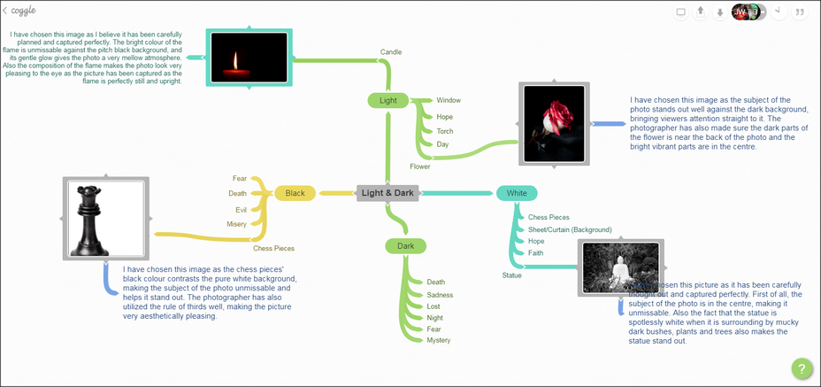
My new theme is 'Light & Dark', which means dark and bright colours, black and white and colour contrast. However this can also can include shadows, which is what I am going to focus on throughout my project, as well as objects against a dark/black background. Weather/Time will not affect my photos, as I will be taking the pictures in a set up studio indoors. I will use Photoshop to improve my photos, particularly to make my photos black and white, as it clearly shows I understand my project, also the sharp contrast in colours can improve the picture. For my research, I looked at two photographers, Billy Kidd and Dan Lavric. My first photoshoot is inspired by Kidd's work, as both my future photoshoot and his work consists/will consist of decaying flowers against a black background, showing a clear, sharp contrast in colour. However, differently to Billy Kidd, Lavric enjoys taking pictures of regular objects and settings, usually outdoors, but sometimes indoors, with no preference to the amount of light let into the image (to a degree), as his images are edited to be black and white, explaining why he is relevant to my current project. In my photoshoots, I will make sure my white balance and aperture are correct to suit the pictures I am taking, as too much or too little light can ruin the picture, whether it is edited or not. Despite the main focus of this project being the dark and light colours, and colour contrast, I will also put thought into composition, as this can improve the aesthetics of my images. During this project, I hope to improve my Photoshop skills, and learn how to use a indoor set-up studio effectively. I aim to have a set of at least 4 edited images that are creative and have thought and time put into creating them at the end of this project.
Billy Kidd Mood Board:
Dan Lavric Mood Board:


Researching Photographers That Inspire Me:

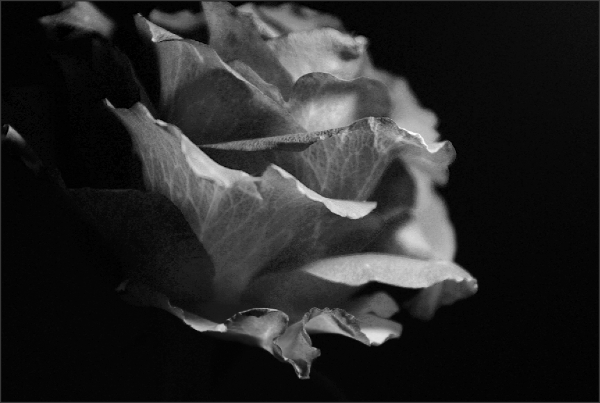
Billy Kidd:Billy Kidd is a self-taught American Photographer, born in 1980. He shown an interest in decaying flowers in front of a black background, which I believe he did to bring the viewers attention straight to the subject of the photo. He captures the flowers in a different way, as he shows the natural shapes and forms the petals create.
|

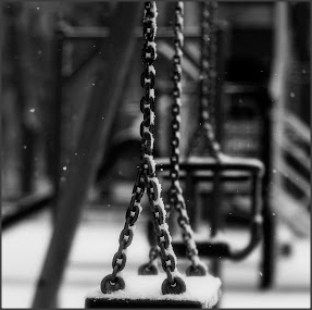
Dan Lavric:Dan Lavric is a Romanian photographer. He particularly likes taking black and white photos, especially of everyday objects such as spoons, candles and swings. I believe he is interested in this as he doesn't like too much happening in a photo and likes to keep them simple, though they still look incredible.
|
Light & Dark Mindmap:
Analyzing an image:
Context:
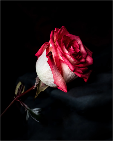
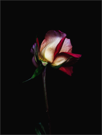
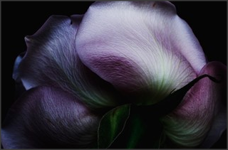
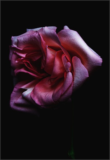
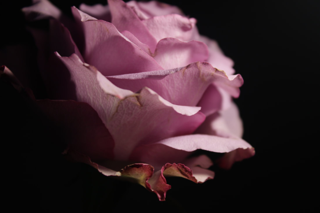
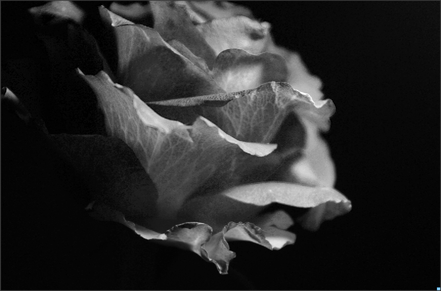
'Billy Kidd is a self-taught American Photographer, born in 1980. He shown an interest in decaying flowers in front of a black background. He captures the flowers in a different way, as he shows the natural shapes and forms that the petals create.'
Composition:
The focus point is clearly in the petals of the flower. There are two leading lines I can see in the photo, a vertical line on the left of the photo, and a diagonal one following the edge of the petal on the far right. The lighting looks like a dim lamp is shining from the top corner, creating a sort of eerie mood. It also creates a hard contrast as the light brightens the flower, making it stand out even further against the pitch black background. My eye is drawn to the petals around the edge of the flower, as the soft, light pink colour grabs my attention. They have used a medium depth of field when taking this photo as the photographer has managed to make sure each detail and line on each petal is clear to see, while making sure the dark stem blends in with the dark background to ensure that none of the attention is taken from the flower head.
Content:
The image shows a decaying flower, but the photographer still captures the bright colours and the detail of the petals. The photographer also captures the bright parts of the flower in the centre and makes sure the dark stem is in the background, so that it blends in with the dark background. The fact that the flower is decaying, to me, creates a sad, glum mood.
Connection:
The theme in this picture is 'Decaying Flowers', which isn't particularly similar to my 'Light and Dark', but in both it involves a bright object standing out against a dark background to grab people's attention. This image links to my work as I want the subject of some of my photos to be flowers, and I will use a dark background to make bright objects stand out. From these pictures, I can see that sometimes having the subject of the photo dead in the centre instead of using the 'Rule of Thirds' all the time as I do, can actually be very effective.
Comment:
My favourite part about the image is the meaning behind it. Even though Billy Kidd likes taking photos of decaying flowers, he still captures the beauty in an object that many people would consider useless. I also find it very clever that the photographer made sure little light went onto the stem of the flower, as he needs it to blend into the black background, ensuring that the attention isn't taken away from the flower head. I can not see any major weaknesses in the picture, which is good as Billy Kidd is a professional and making serious mistakes as a professional could affect him badly. However, I think he should think about using the 'Rule of Thirds' in other Decaying Flower pictures. I am going to use this to make sure my work is the best as it can be, as this image shows that objects you may no think can be useful for a picture, actually can be (dying flower). Also if an image has a dark sections i'll make sure to have them blending into the background to make sure no attention is taken away from the subject of the picture (like the stem).
Analyzing an image:
Context:
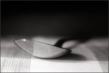
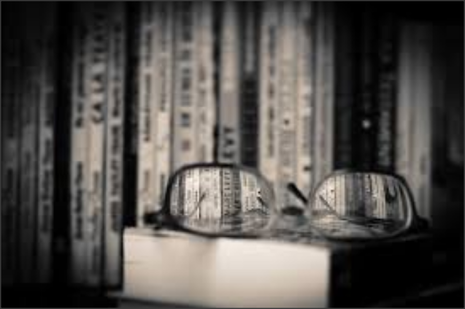
This a 'Still Life picture taken by Romanian photographer, Dan Lavric. This picture is a 'Camera Obscura' style image, which is also known as pinhole image, is the natural optical phenomenon that occurs when an image of a scene at the other side of a screen (or for instance a wall) is projected through a small hole in that screen as a reversed and inverted image (left to right and upside down) on a surface opposite to the opening. The surroundings of the projected image have to be relatively dark for the image to be clear, so many historical camera obscura experiments were performed in dark rooms.
Composition:
The focus point is on the lens of the glasses, as they are the only parts of the image in focus. There is a clear horizontal leading line, going across the middle, at the top of the glasses, which perfectly splits the image in half. Dan Lavric utilizes the 'Rule of Thirds' well, as the books and glasses are located in the centre and the right of the photo. My eye is drawn to the glasses, as they are in the centre of the photo. The photographer uses a very shallow depth of field, as the only parts of the photo in focus are the lenses of the glasses. In order to make the picture more interesting, and not have a boring blank, dark background, the photographer took the picture in front of other books, which also gives an object to see in focus through the glasses' lens.
Content:
The subject of the photo is the pair of glasses resting on a pile of books. The soft contrast between the light and dark colours, to me, gives off a mellow, relaxing mood. I think this photo could have been taken at a library, as there are many books, and also libraries are meant to be quiet, relaxing places, and the photo gives off a relaxing tone.
Connection:
The theme of this photo is 'Light and Dark', which links to my work as I will also be looking at contrasting colours and tones. This image is similar to the photos I will take, as this picture focuses on ordinary objects, like glasses and books, which inspires me to use everyday objects as this photograph shows how incredible a photo can look without going all out to get exotic objects or models. I believe that the image is black and white to ensure that viewers aren't distracted by colour and take the time to think about the objects within the photograph.
Comment:
One thing I like about the image is the simplicity. The photographer (Dan Lavric) knows and understands that you do not need to make pictures too complicated to make them interesting and look amazing. Another thing I am impressed about by the photo is how the image doesn't look forced. The subjects of the photo link together well, which makes the picture look even more aesthetically-pleasing.
Content:
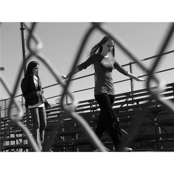
In the photo, we see 2 girls next to what looks like sports stands. The picture has been taken through a chain link fence, but captures the girls in between the gaps, which makes the picture more pleasing to look at. I believe the picture is only a few years old, as even though the picture is black and white, the objects in the picture look modern, and the clothes the girls are wearing don't look old. I think this picture was taken in a school in America, as the seating stands look like they are in a school in the U.S.
Composition:
I believe the focus point is from a worm's eye view, as we are looking up at the girls, even though they are not very tall. To me, a very strong, clear leading line is a the top bar of the stands, as it follows the direction of the photo and it intercepts the main subjects in the photo (the girls), as it goes through their elbows. There is as clear contrast in colours, as the sky is white, but the dark stands contradict this. My focus is drawn to the girl on the right, as the camera is closer to her than it is to the other girl, and the picture has been captured to ensure that the chain link fence acts as a frame around her.
Comment:
One of the things I like about this image is the way I think the whole photo contradicts itself, as the chain link fence reminds me of a prison, but beyond the fence is two girls who appear to be having fun. Also the sky is pure white, however this is contradicted by the darkness of the stands. One thing I do not like about the image is there is no clear meaning behind it that you can infer from the image. Some may say that photography is about what you think the meaning is but I believe you should be able to see a story behind the picture.
Content:
In this photo, we see two girls next to seating stands. The photo has been taken through a chain link fence, but captures the girls in between the gaps, which makes the picture more pleasing to look at. I believe the picture is only a few years old, as even though the picture is black and white, the objects in the picture look modern, and the clothes the girls are wearing don't look old. I think this picture was taken in a school in america, as the seating stands look like they are in a school
Connection:
I believe this links to my work as it follows the theme I am currently working on, which is Light and Dark, as this picture is black and white.This also links to my work in the way that the stands create many shadows making beneath them look really scary and dark, which is similar to the way i am experimenting with shadows. I believe there is no clear message or story behind the photo, which makes it slightly tedious.
My Theme:
The theme I have chosen to do is 'Light and Dark'. I want to take pictures of bright objects against dark/black backgrounds and use the contrasting colours to make my pictures stand out. I may also try and go to different locations to find objects or even just inspiration. Some of my pictures are going to consist of black and white, as I believe you can make certain black and white images look very aesthetically pleasing. However I will also take some pictures that consist of light and dark colours as I have seen what Billy Kidd has done with bright flowers and dark backgrounds and it inspires me. The photographers I am interested in are Billy Kidd and Dan Lavric. Billy Kidd's flower pictures look really incredible and inspires me to make some flowers the subject of some of my photos. Dan Lavric's pictures are really good to me as the way he captures a moment and the angles he uses to take a picture are similar to the way I take photos. I want this project to help develop my creative side, and I want to be able to think of how to take pictures from different angles and different perspectives.
Photoshoot Plan:
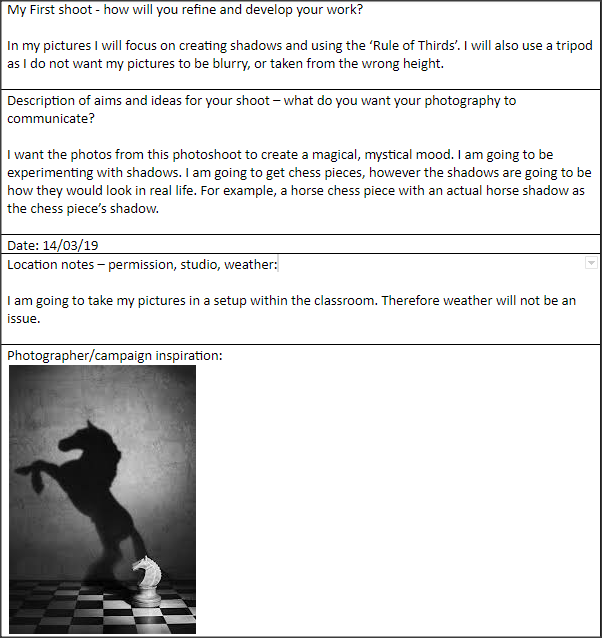
First Photoshoot:
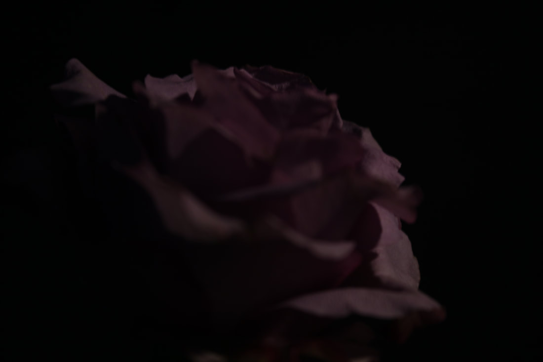
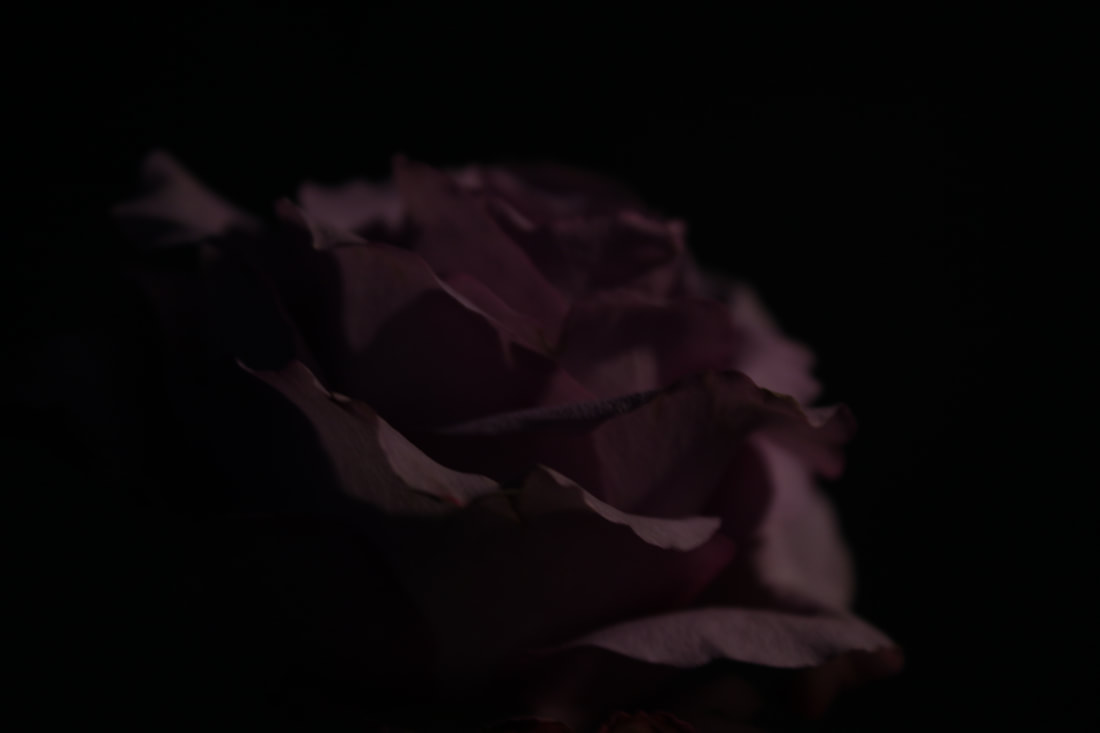
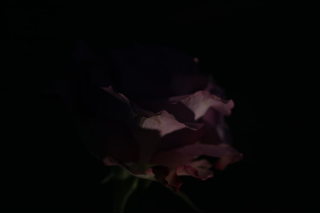
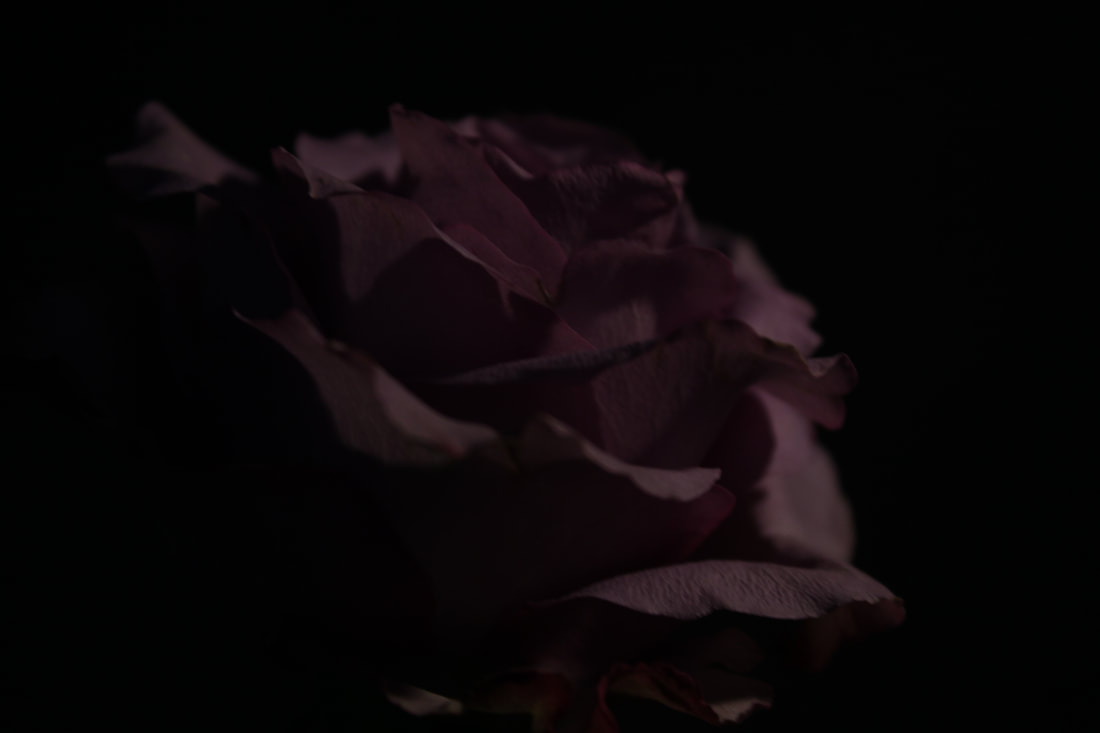
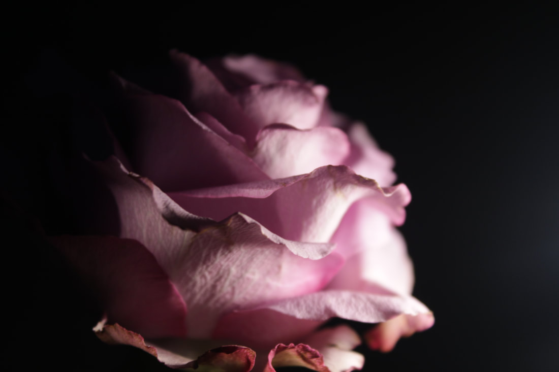
This is my first 'Light and Dark' photoshoot, and using inspiration from the photographer Billy Kidd, I decided to take photos of decaying flowers. It was more difficult to get the lighting correctly than I thought it would be. However I believe I managed to get a good shot (bottom right). Next photoshoot, I will choose a wider variety of flowers, and also spend more time experimenting with lighting, because as you can see in the first four photographs the image is too dark, meaning I could not capture the details on the petals like I did in the last photo.
Best and Worst Photo:

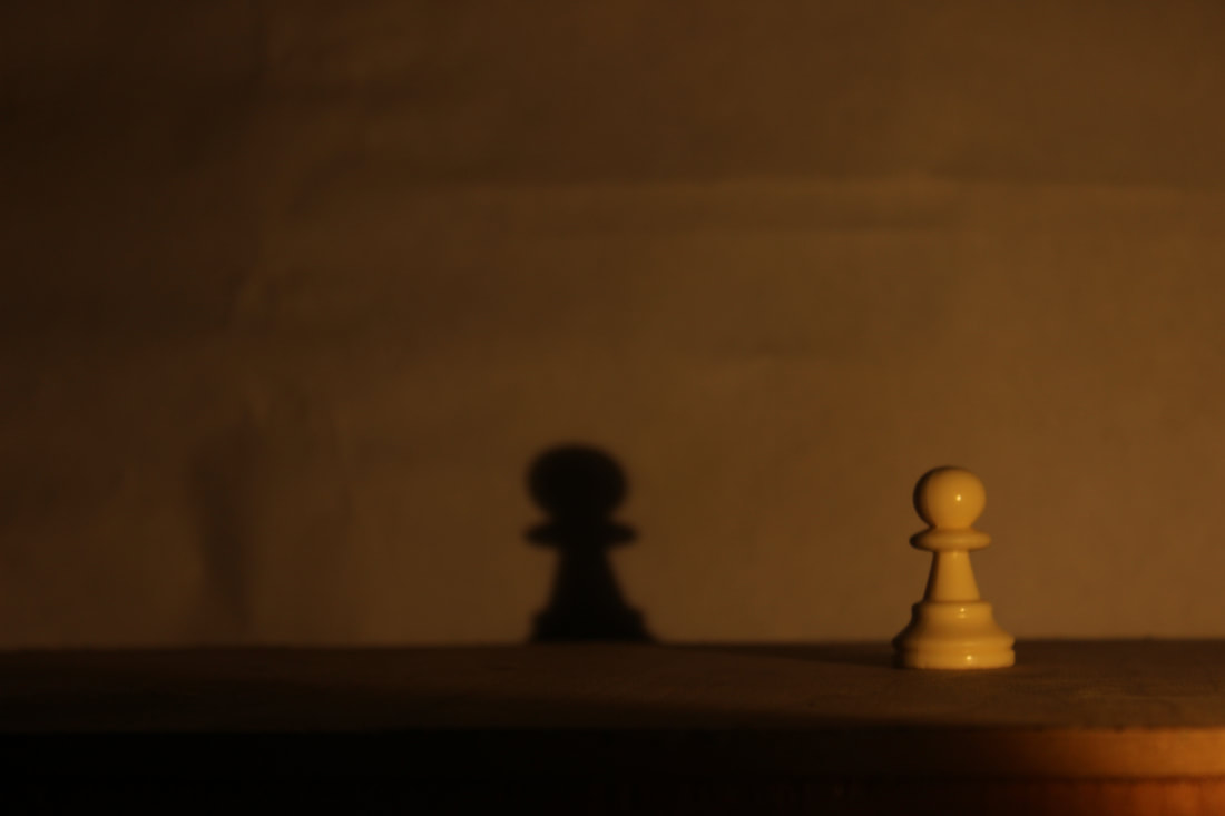
I believe this is my best photo as the image is in focus, giving it a crisp and sharp look. I was also able to capture the details of the flower, which in my opinion makes the flower look delicate. I also believe the light is good, however it may be a little too harsh on the top of the flower.
|

I believe this is my worst photo as the image is not focused. The light is also not pointing directly at the object or pointing near it, so the picture is too dark to see the flower clearly. The flower is also in the centre of the photo, not demonstrating my knowledge on the 'Rule of Thirds'.
|
Editing my photo:

Step 1:
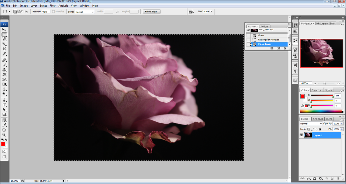
I placed my best picture on Adobe Photoshop
Step 2:
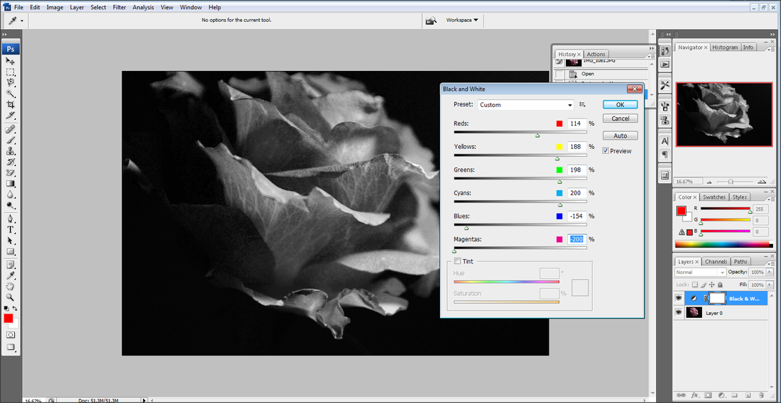
I pressed on the black and white symbol in the bottom right of the screen and changed the colour settings to the ones shown in the picture
Step 3:
I then saved my photograph
I placed my best picture on Adobe Photoshop
Step 2:
I pressed on the black and white symbol in the bottom right of the screen and changed the colour settings to the ones shown in the picture
Step 3:
I then saved my photograph
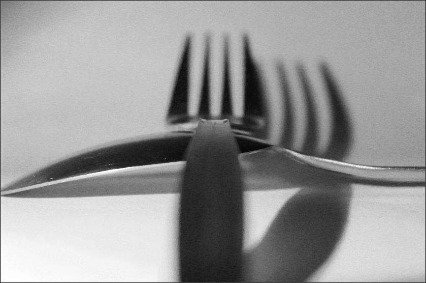
Photoshoot 2:


For this photoshoot, I decided to use cutlery as props, as I had the idea to create interesting shadows using the shapes of the kitchen utensils. The pictures do show some unusual shadows, however, I don't believe these set of pictures are entirely successful compared to how I envisioned them to turn out. However, I wouldn't deem them unusable.
Best and Worst Photo:

I believe this is my best photo, as the object is in focus, making the image crisp and clear. I also captured the photo while the fork was on the left and its shadow on the right, demonstrating my knowledge on the 'Rule of Thirds'. I also think the lighting was just right, not too harsh, not too soft.
|

I believe this is my worst photo from this photoshoot, as the angle that I took the photo from means it is hard to understand what the object is. There is also only a tiny portion of the photo in focus as I was zoomed in to the object too far. I also believe the lighting was too harsh on the left side of the photo.
|
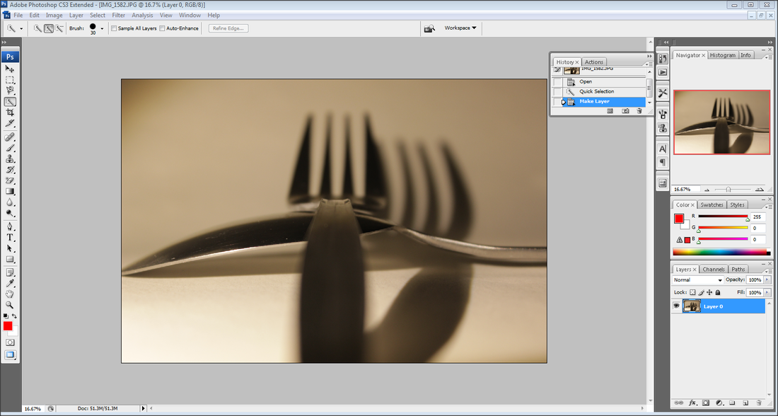
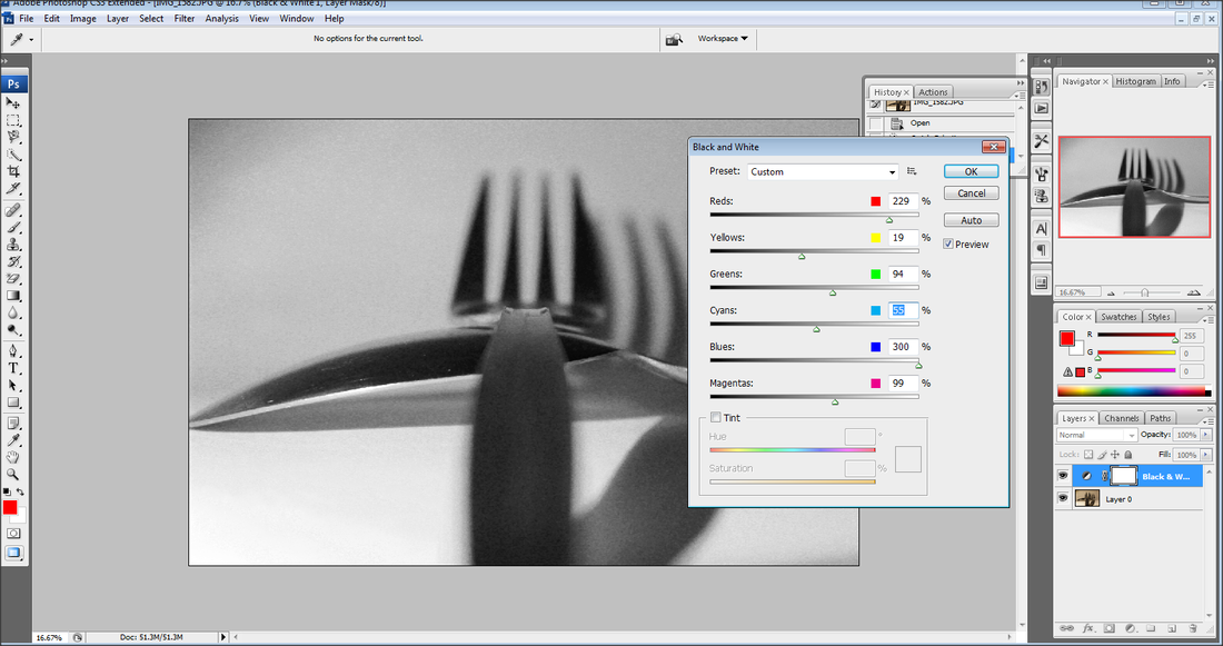
Editing My Photo:
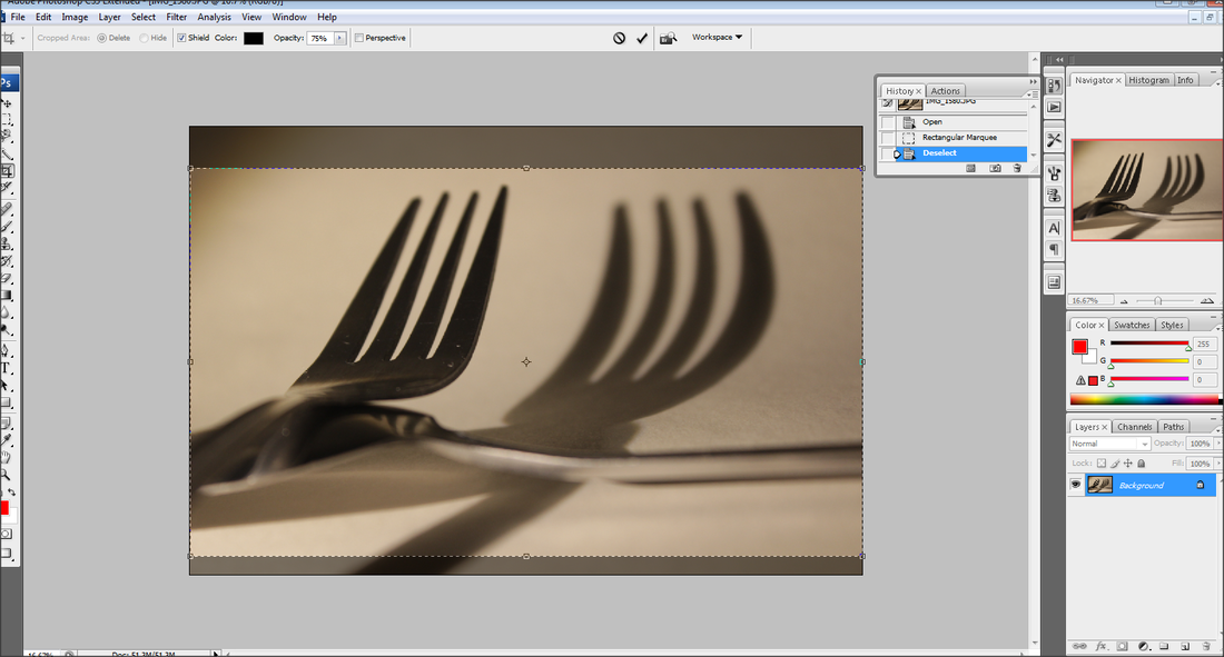

Step 1:
I placed my best picture on Adobe Photoshop
Step 2:
I pressed on the crop tool and cropped out the dark top left corner which i believe ruins the picture
Step 3:
I then saved my photograph
I placed my best picture on Adobe Photoshop
Step 2:
I pressed on the crop tool and cropped out the dark top left corner which i believe ruins the picture
Step 3:
I then saved my photograph
Edited Photos:


Photography Tutorial:
This video goes through 7 Tips that help you take amazing looking pictures.
Video credit to: https://www.youtube.com/channel/UC2Z3a-c4dRsoVPBnlQl6cUQ
Video credit to: https://www.youtube.com/channel/UC2Z3a-c4dRsoVPBnlQl6cUQ
Chess Piece Photoshoot:


In this photoshoot, I used what I learnt from the video, while following the photoshoot plan. In the video, it describes how much thinking about composition when taking the photo can improve your photography skills, so in this photoshoot, I tried to get the shadows of then chess piece in the middle left section of the picture. However, after trying to edit my pictures in photoshop, I came to the decision that the pictures would look better against a black or white background, and I should pick a different composition for the chess piece. I will have to do another photoshoot for this photoshoot concept.
Setting Up For The Photoshoot:
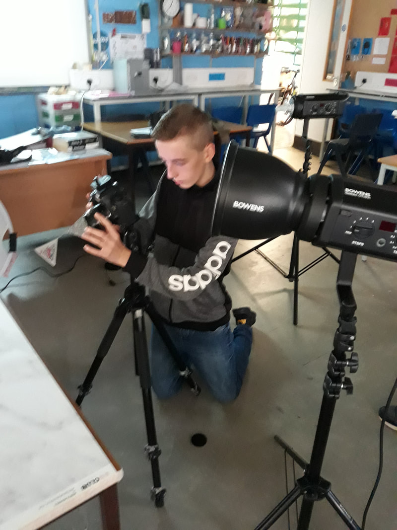
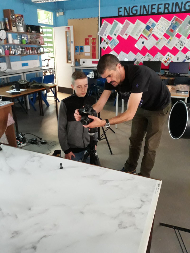
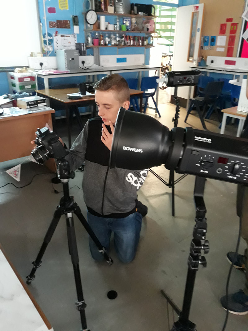
A professional photographer, Justin, was brought him. With him, we set up a studio with professional lighting to try and get the best outcomes possible.
Chess Piece Photoshoot 2:
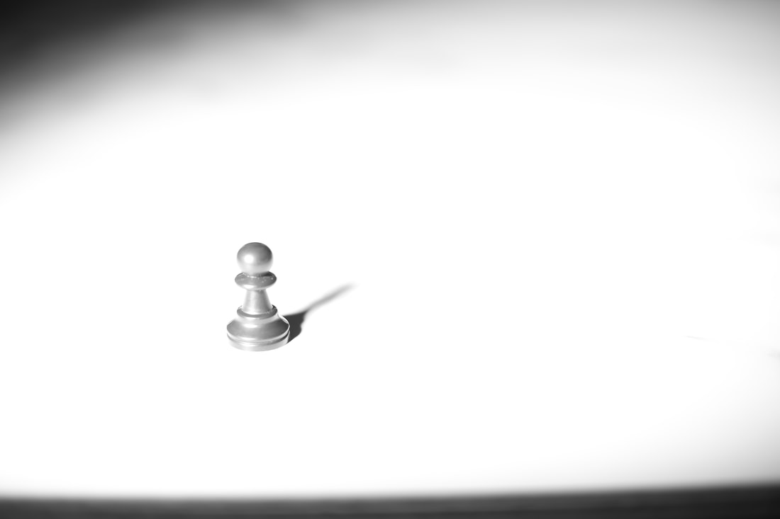


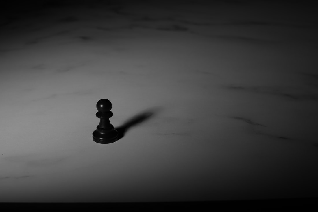
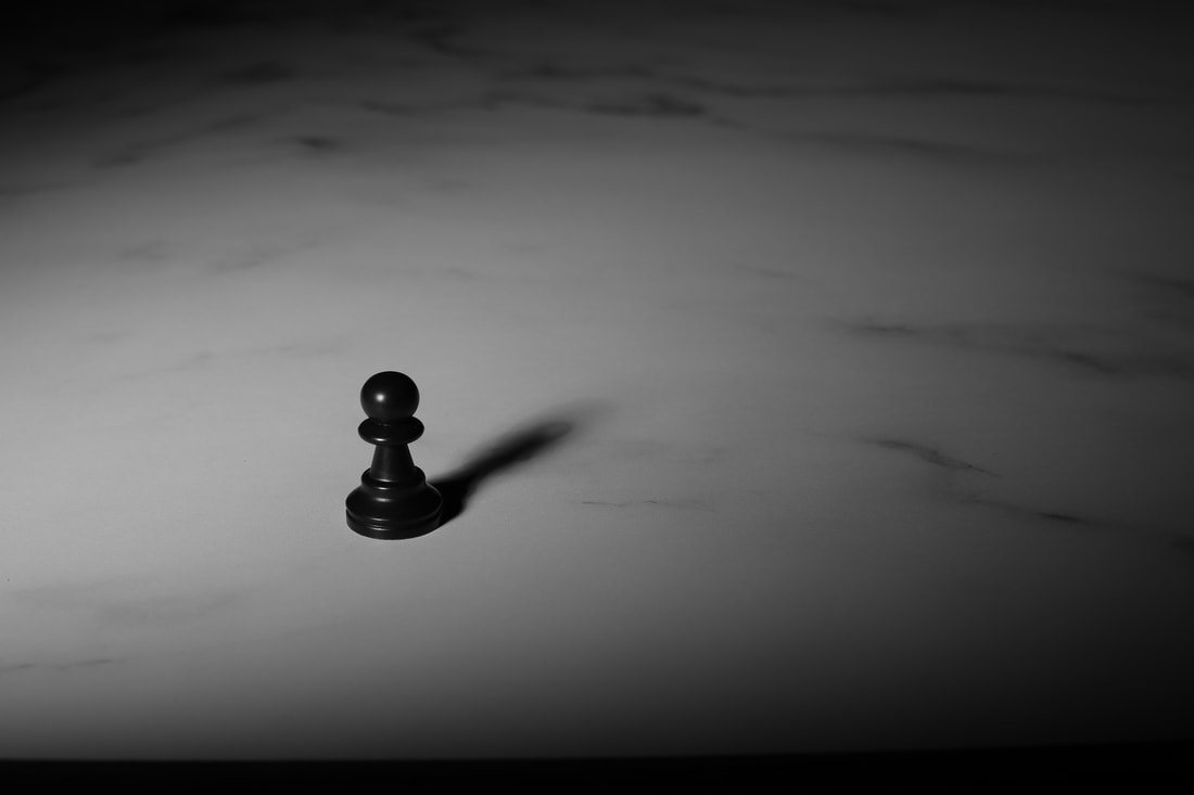
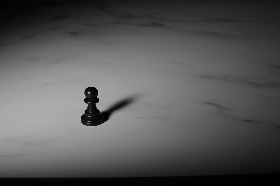
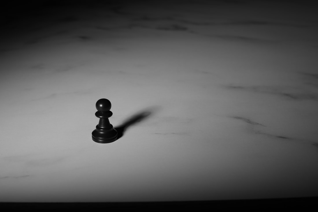
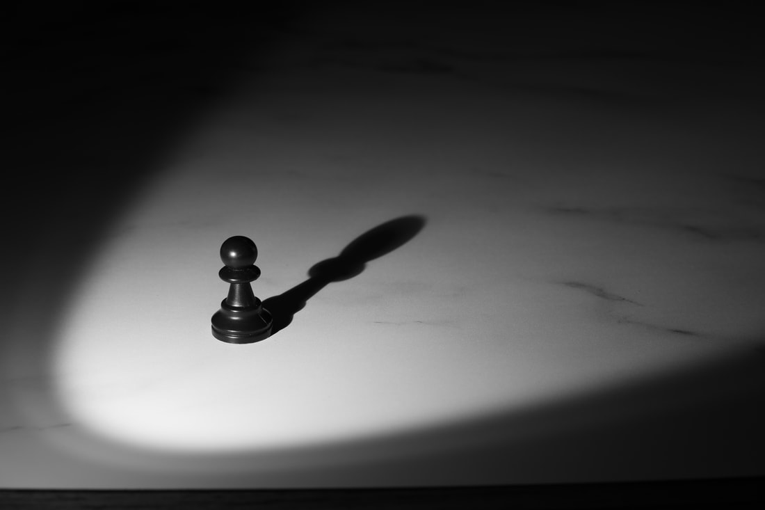

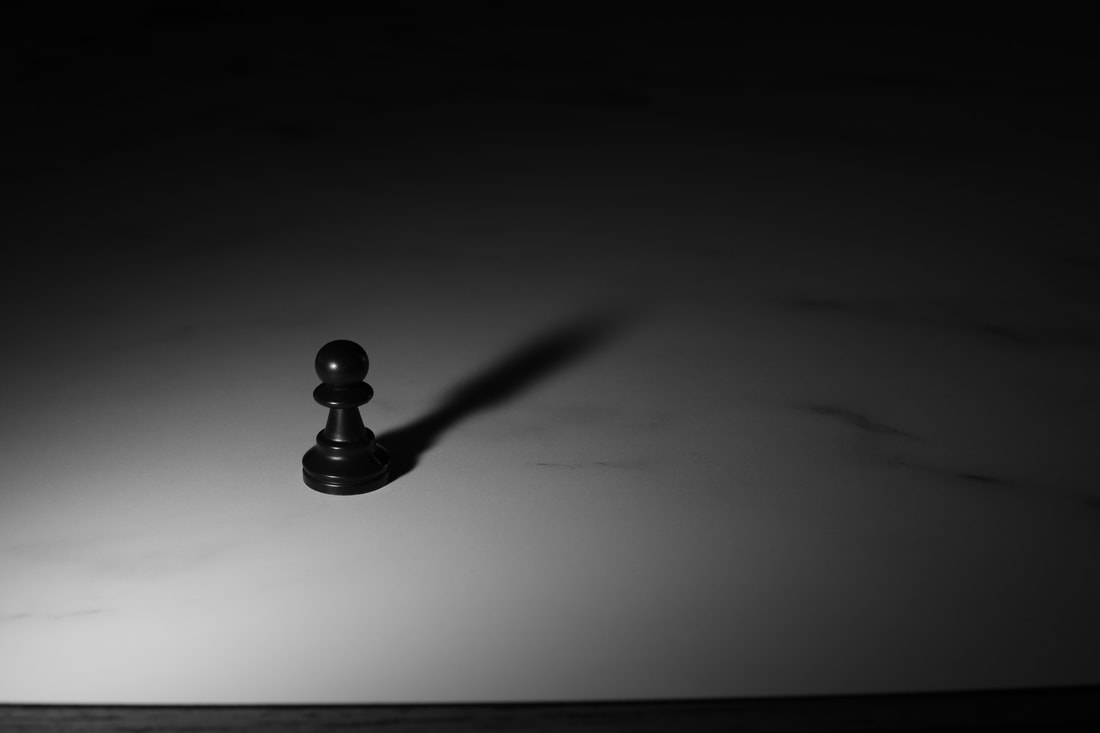
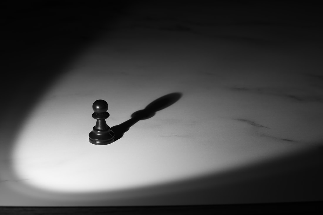
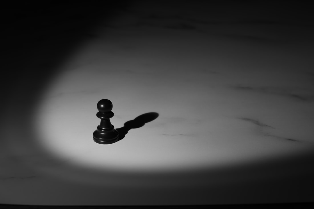
Chess Piece Photoshoot 2 (King Piece):


Exploring on Photoshop:
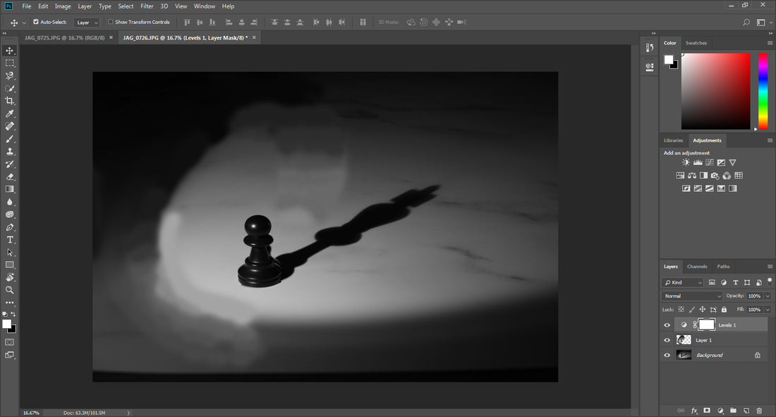
This picture has been edited to be a simple black and white, which i feel could be effective as it draws our attention straight to the subject of the photo, allowing us to think about the meaning behind the photo
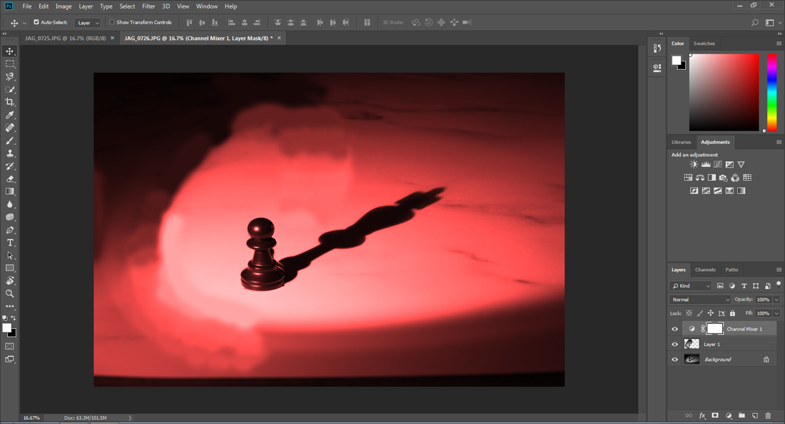
After editing the photo to this, it made me feel like it expands on the photos meaning even further, since it shows a pawn piece who aspires to be the king, while the blood red tint of the photograph gives it a eerie mood, making me think of blood. With these tones being created, it gives the photo a story, as if the pawn is willing to kill to become the king.
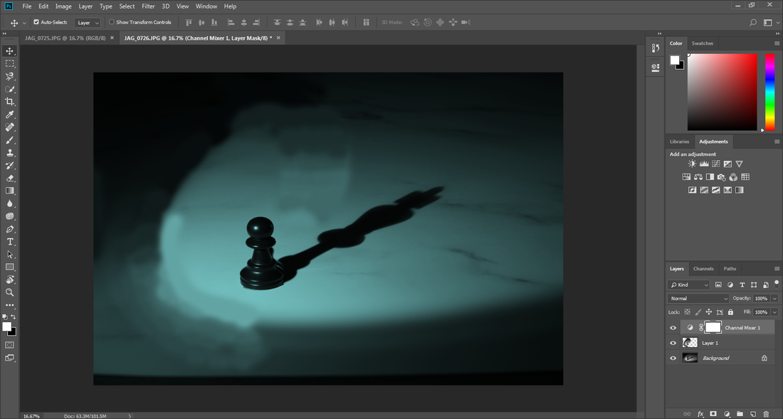
This photos blue tint gives the picture an eerie, slightly depressing tone. Unlike the red one below, this picture gives off a sense of sadness and desperation from the pawn piece, rather than anger and violence given off by the spooky red tinted picture.
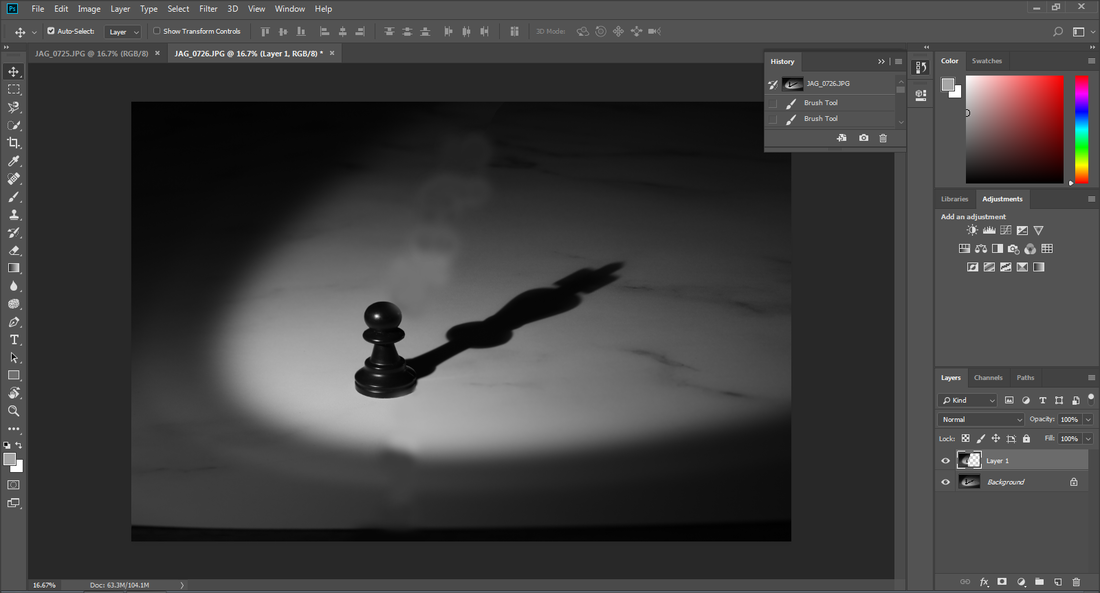
With this image, just like the first edited piece, I left the image in the black and white colours it was taken in, however in the first photo I believed the colour smudges were too noticeable, and took attention away from the subject of the photo. Because of this, in this photo I tried to keep the colour smudging to a minimum, and I believe it looks far better and less noticeable than in the first image.
Final Image:
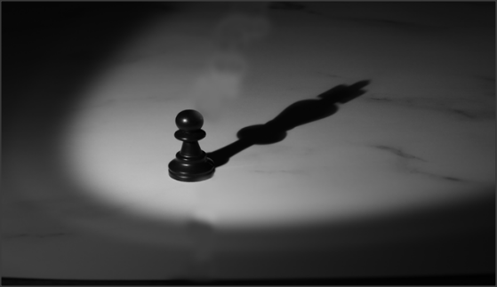
I have left the image black and white, as I believe changing the colour takes attention away from the actual purpose of the photo. I believe the image's meaning is very strong, and I personally believe the way I have taken this photo has shown that I have executed my idea well.
Final Gallery:


Final Evaluation:
Our project theme was Light and Dark, meaning photos that have a harsh contrast in colour, or photos that involve shadows or black and white themes. I believe it was a great theme for me as it allowed me to use my creative side when taking pictures. The part I enjoyed the most is experimenting with shadows , as I found beautiful pictures could be taken while utilizing simple things, which not only allowed me to create some very interesting pictures, but also taught me resourcefulness, which will help me in future photoshoots/projects. A technique I need to develop in order to improve my work is my Photoshop skills. If I had more advanced Photoshop skills, I could make my pictures look more professional. To help with my work, I researched the photographers Dan Lavric and Billy Kidd. Billy Kidd liked taking photos of vibrant flowers against black backgrounds, while Dan liked contrasting colours like black and white. The problem I encountered during my work was trying to edit certain photos to make them look professional, such as trying to edit shadows on to other pictures in order to create an interesting effect. I came to the conclusion that I bit off more than I could chew with that photoshoot, so I decided to take a different approach to photography with shadows. For my next project, I will ensure I have the Photoshop skills needed to improve my pictures.
